Solving the world’s dumbest problem (food waste)
Roughly one third of the food produced in the world for human consumption every year (approximately 1.3 billion tonnes) is lost or wasted. The price of food losses and waste amounts to roughly 680 billion US$ in industrialized countries and US$ 310 billion in developing countries. Food waste happens in many walks of life, in large quantities from big restaurants, to single homes not keeping leftovers; food waste is all around us. The effects of food waste are catastrophic and effect millions of people. There are efforts being done to combat food waste and to improve the situation, but more can be done.
People want to be environmentally conscious, especially when it comes to reducing Food Waste, which is often referred to as “the world’s dumbest problem”. Reducing food waste not only lowers your environmental footprint, but it also helps users save money and live healthier lives.
Steps required to reduce food waste are relatively simple but current solutions leave a lot to be desired in terms of features, incentives and user experience. Existing solutions add to unnecessary steps and are inconvenient to use, thus adding friction to an already tedious process, and remain largely unused.
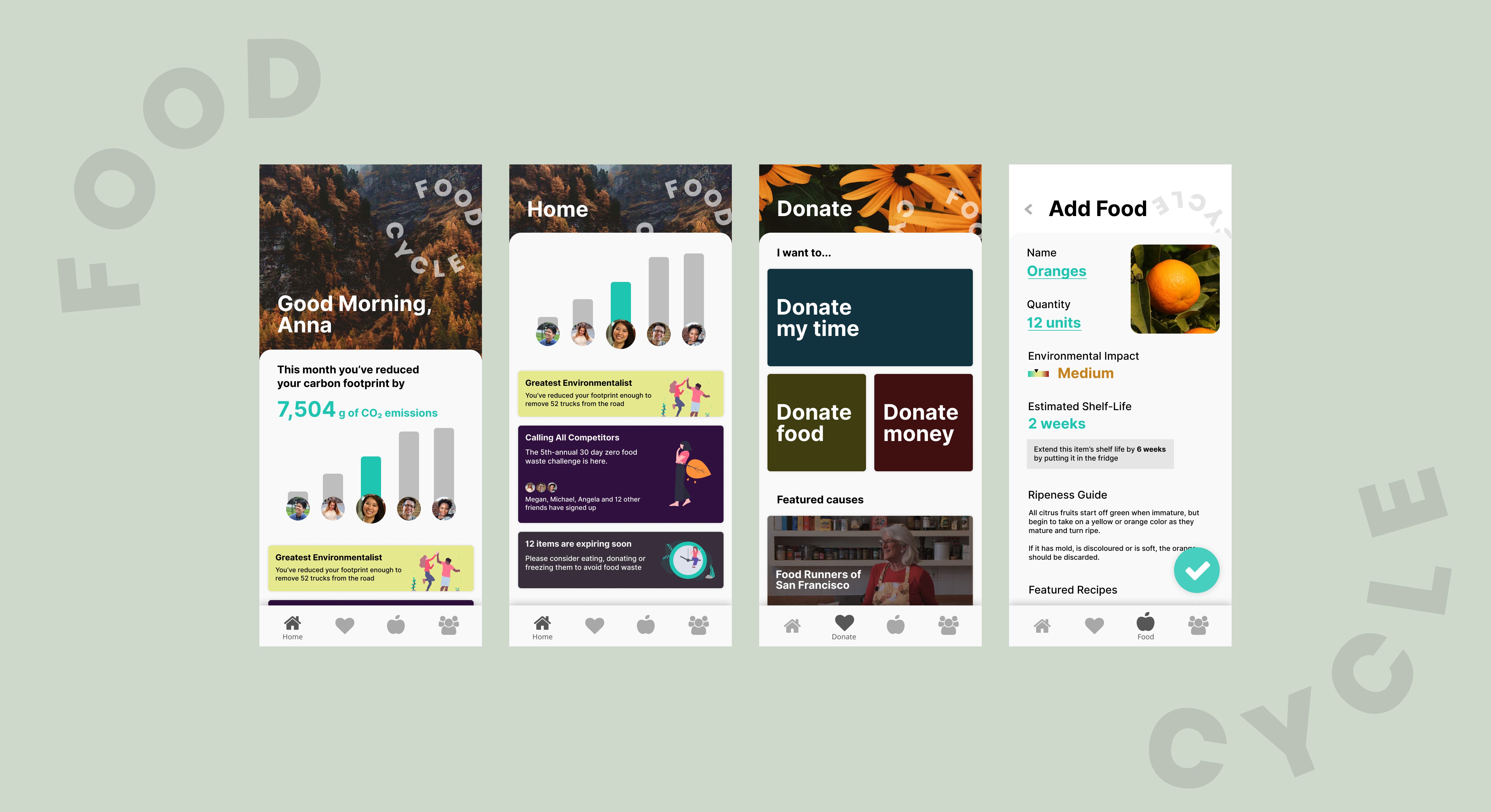
Challenge
Your challenge is to build an experience that helps people be more conscious about food waste.
My solution was created in a little over 4 hours using Figma. You can view the final solution here: https://www.figma.com/file/LcMsLe5mDBxVsG7R8uihPTFF/FoodCycle?node-id=3%3A17 and learn a bit more about my process below
Introducing FoodCycle
After doing some initial background research and early exploration, I decided to design an iOS App called FoodCycle.
I created my solution using Figma. It features a clean modern card-based design, with many photos of nature, which highlights the positive environmental impact users have by using this app. It also features a spinning logo, which is a unique branding element that also serves as a reminder of our food cycle and reminds users to treat food in a more thoughtful manner.
Background
I started my research by watching a CBC Marketplace special titled “Food waste: What some supermarkets throw out”. I was shocked and horrified at the amount of food wasted as shown in the episode and was inspired to see how the problem could be solved at a personal level, instead of a business.
During my internship last term at Figma in San Francisco, I also became aware of an organization called FoodRunners which is an organization that connects companies that have leftover food, with organizations that feed vulnerable people. I also referenced articles from the World Economic Forum and The Conversation to influence my solution.
Target Audience
The target audience for an application like this would be anyone who is looking to reduce their environmental footprint by cutting down on their food waste. It is primarily targeted at the individuals that make the food purchasing decisions in a household, and those that have a little more time to be meticulous and are able to help out within their community.
Process
I started by brainstorming potential solutions to this problem and how an app could be designed to take these solutions into account. Next, I determined the main goals of this application and brainstormed features to accomplish the goals and implement the solutions. I was then able to section off my features into four sections (home, donate, food and social) and started designing and iterating through multiple designs.
Key Features
There are 4 main sections of this application
Home
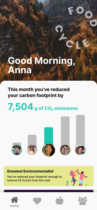
This is the main screen of the application. It puts a friend leaderboard and a quantity (g of Carbon Dioxide emissions) front and centre. This provides a gamification aspect of the app, which incentivises the user to use the app more and compete with friends.
The home screen also contains different cards which can celebrate accomplishments, highlight updates from friends, challenges, product updates, advertisements and updates from other aspects of the app (donate, food, social)
Donate
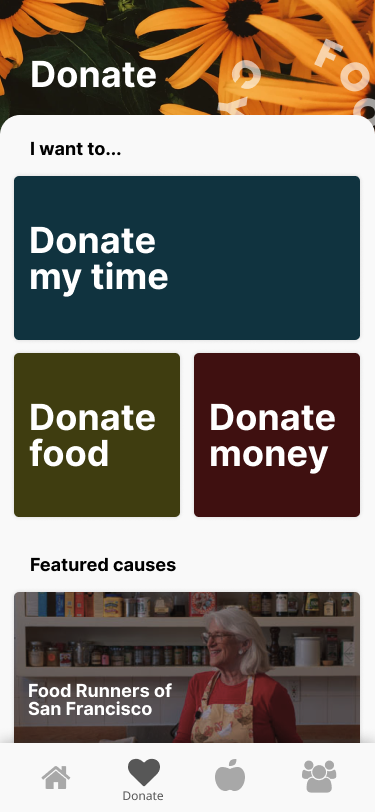
The donate tab here mainly serves as a tab to encourage users to explore and learn more about how they can help out by donating (time, money or food). By participating in any type of donation, users will be able to reduce their footprint which earns points for them (thus increasing their leaderboard position). There is also a “featured” section which enhances discoverability of new opportunities to give back to known, reputable charities.
Food
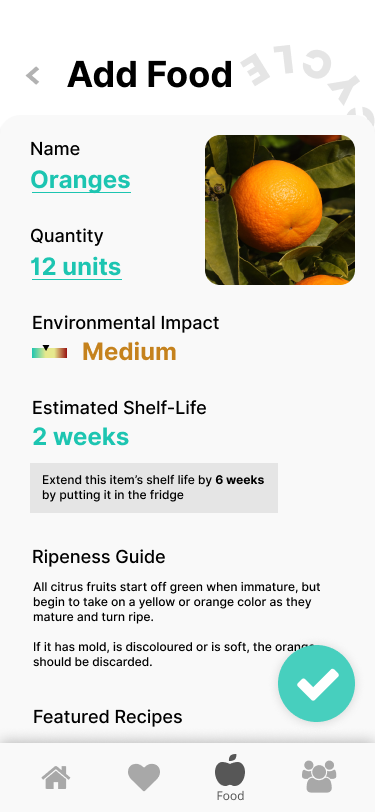
The food section allows users to log the types of food they have in their pantry/fridge. It will provide them information on how to store items properly to extend the shelf life, environmental impact (e.g. meat will have a significantly higher impact than oranges for example. It will give an estimate of it’s shelf life and will also give users information on how to tell if a product is ripe or rotten. It will also suggest recipes to users for ingredients that are set to expire.
Competitors
The main competitors to FoodCycle is NoWasteApp and FreshFridge. Both competitors are primarily a fridge tracking application and don’t provide anything beyond that. Both competitors also are a lot less user friendly to use and provide no incentives (such as gamification, donation and social connections) thus providing an inferior experience.
Constraints/Conventions
For this exercise, I decided to primarily design an iOS app. This is because of my personal familiarity with iOS and the Apple Human Interface Guidelines. It is also because the app has a lot of functionality that needs to be accessed on the go, such as at a grocery store, by the fridge and out in public. I would also consider creating a web application as it is easier to input data and consume data on a computer as well as an application would allow this app to be accessed from anywhere on any device. I would also create an Android version, but adapt it to the Google Material Design standards.
Learnings
Overall, I really enjoyed this exercise as it was fascinating to get such a vague and ambiguous problem and really go through the entire process from initial ideation to hi-fi mocks.