
Creating Blimp, a personal dashbaord experience
As part of my Software Engineering degree, the Fourth Year Design Project (FYDP) or Capstone is a year long group project to conceptualize and design a software project. My group members and I decided to create a new product in the area of data visualization and user experience.
](https://cdn-images-1.medium.com/max/2752/1*ncewmJcZEgU2kyKIpDQQTA.png)
This report outlines the product vision for Blimp, technical architecture and focuses on the frontend state management aspect of the application, especially the theming and widget functionality.
What is Blimp?
](https://cdn-images-1.medium.com/max/2000/0*5Lbca-0b_GFRGWJS.jpeg)
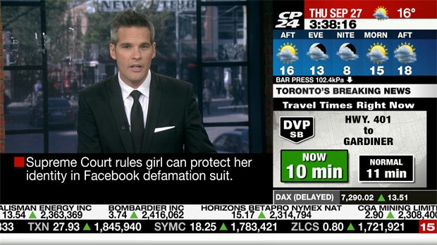
Blimp is a platform used to create personalized dashboards or “blimps”. With a focus on the user experience, customizability, ease-of-use and flexibility, Blimp lets anyone create a dashboard, create different layouts, add widgets and personalize with different themes. We also plan on making Blimp free, crowdsourced, developer friendly and easy to share, opening up customizable dashboards to the more casual user, instead of just the current business and corporate focus.
Who is it for?
Some example use cases are
- Individuals looking to create a one-stop shop view for information relevant to them
- Social media influencers who want to aggregate various platforms into one view
- Conferences who want to show attendees useful information at a glance
- Businesses that want to create personalized, dynamic and useful signage
- Families who want to keep all their information aggregated and display it in a useful manner
Since Blimp will be completely customizable and developer friendly, there is an infinite amount of use cases possible with our application. With a great marketing plan, We are currently pursuing a partnership with Hack the North, which will allow our app to be seen in front of 2,000+ event attendees at Canada’s biggest hackathon.
Goals and features
- Crowdsourced/open-source widgets
- Free
- Customizable widgets
- Easy to use drag and drop user experience
- Easy to share
- Flexible
- Ability to create any kind of grid layout (including complex ones)
- Themable with user customization
Technical architecture
There are 4 main components to Blimp’s technical architecture.
- Backend: Responsible for server-side application logic and storage of data
- **REST API: **Enables communication between the frontend and the backend
- Frontend: Responsible for displaying information to the end user and handles interaction and state changes
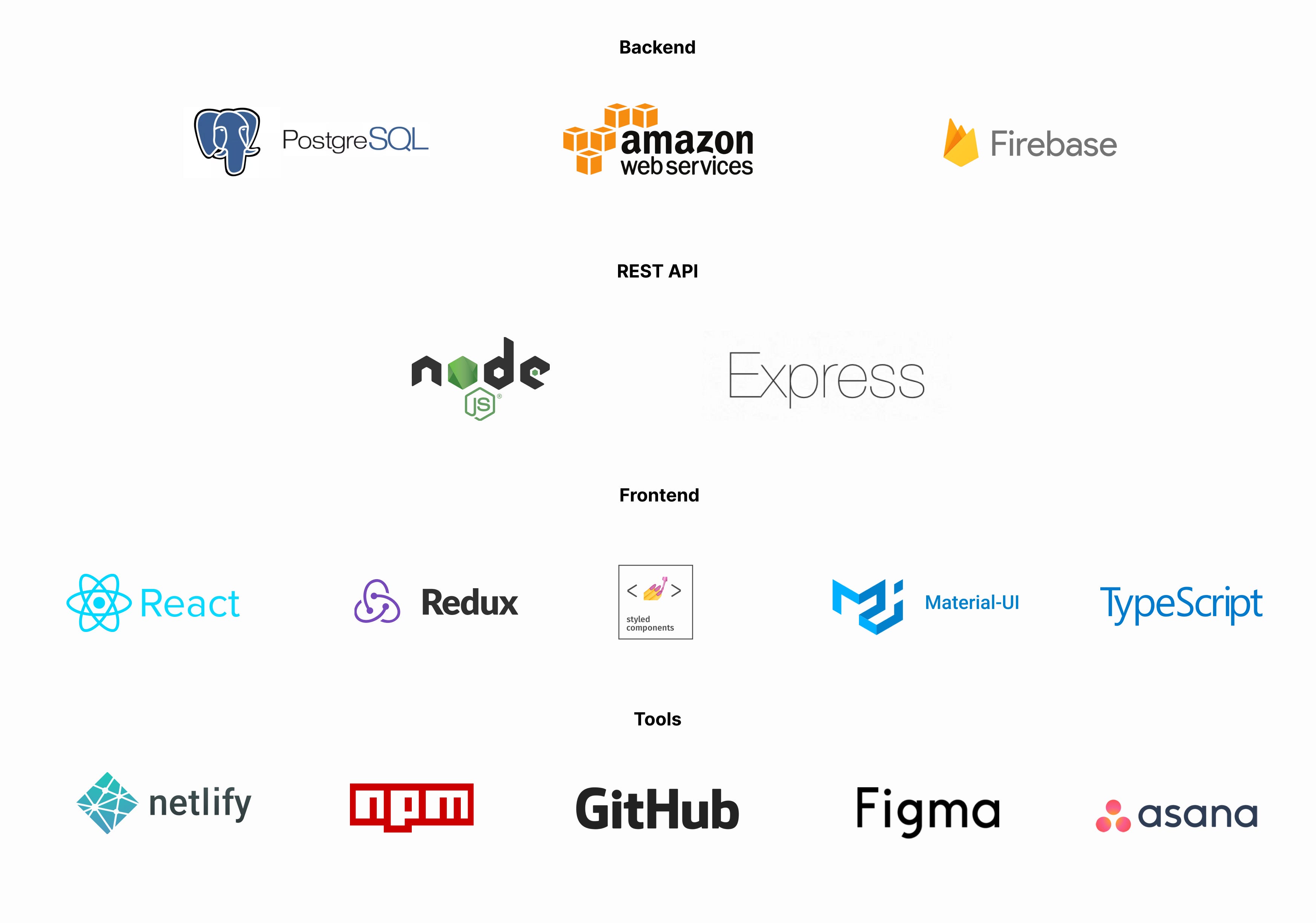
Backend
**PostgreSQL: **Database used to store information (e.g. users, dashboards, roles, etc.)
**Amazon Web Services: **Server architecture used to host application and other data
**Firebase: **Used to handle authentication
REST API
**Node.js: **Server environment for our REST API built on JavaScript. Chosen based on performance benefits in comparison to other languages
**Express: **Web framework for creating web applications and APIs
Frontend
**React: **Library for building user interfaces
**Redux: **Centralized state container and management for React. This makes it easier to split up the frontend into the presentational layer (React) and the data layer (handles in Redux) which also allows us to split up the work in an easier way
**Styled Components: **CSS-in-JS styling. This makes it easy for us to create styles which are scoped to a React component
**Material-UI**: Pre-made React components based on Google’s Material Design. This will allow us to quickly use pre-made components without having to implement our own
**TypeScript**: Typed superset of JavaScript created by Microsoft. This is so that errors can be caught at compile time and reduces code quality errors
Tools
**Netlify**: Frontend deployment workflow. Allows us to easily deploy new versions of our frontend with ease
**npm**: JavaScript package manager. Will be used to componentize our widgets and themes
**GitHub**: Source code version control, continuous integration, code reviews and team collaboration features
**Figma**: UI design tool. Used to design our application before development
**Asana**: Project management tool. Used to keep track of tasks and deadlines
Widgets
](https://cdn-images-1.medium.com/max/2672/1*xwcsbLdJOS1xEIptLLskzA.png)
A widget is the single-most important concept in Blimp. A widget is a responsive, customizable display of information. Without widgets our application is not useful and useful widgets will likely be the main driver of users to our application. Widgets are meant to be 100% responsive at any possible dimension, filling up all of its parent container space. Some examples of widgets are:
- Clock
- Calendar
- Social media
- Photo
- Transit departures
- Traffic
- News
- Weather
Technical specification
All of the following technical details are written using TypeScript. You can learn about the TypeScript type model here: https://www.typescriptlang.org/docs/handbook/interfaces.html
Node: Our abstract base class, widget, root, page and section (root and section to be explained later all inherit from this)
Widget: Type used to define a single widget type (e.g. Clock, Weather)
widgetType stores which widget type a given Widget object is
options data object used to store user preferences/settings for a widget (e.g. timezone for a clock widget)
version used for versioning purposes
theme and themeOptions are used to accomplish our goal of having a theme-customizable dashboard, we allow themes to be overwritten at any node (by default they will inherit from a parent node)
interface Node {
  type: string
  theme?: string
  themeOptions?: any
}

interface Widget extends Node {
  widgetType: string
  options: any
  version: number
}

// example
{
  type: 'blimp::clock',
  options: [
    timezone: 'America/Los-Angeles',
    showDate: true,
    use24HourTime: false,
    showSeconds: false,
  ],
  version: 1.0.2
}
Widget management
Since widgets are meant to be crowdsourced and customizable, we need to find a way to be able to share widgets and allow users to customize. We decided to create a new public GitHub repo and package the widgets using npm which will allow us and other developers to easily contribute new widgets by opening up a pull request in the repo and importing the new version via a npm module so our frontend can access the widget.
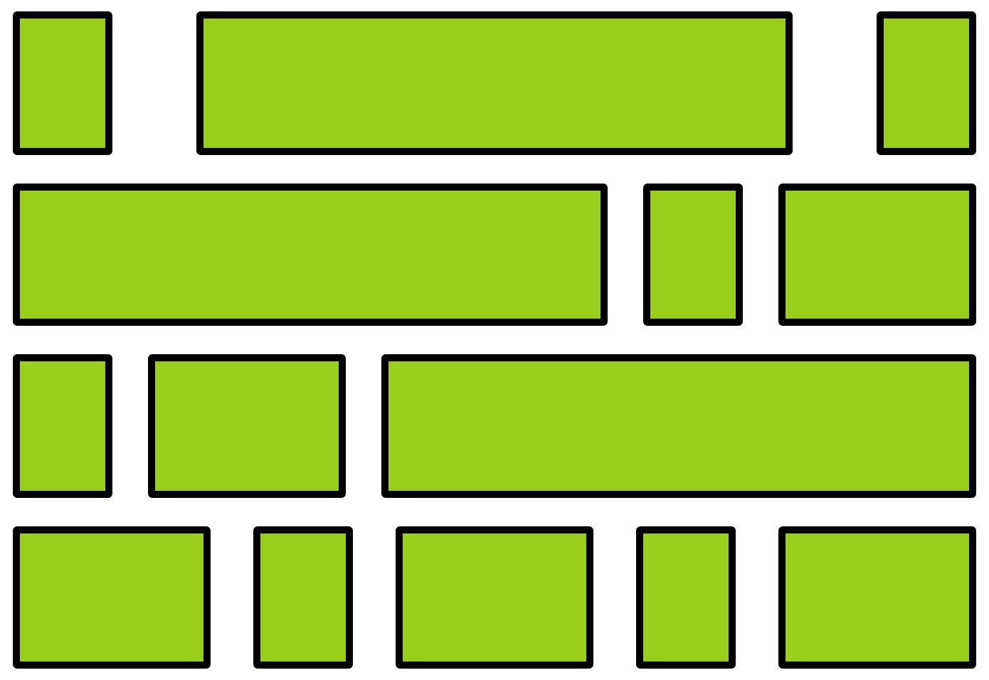
Layouts
](https://cdn-images-1.medium.com/max/2780/0*WmDgu636cKOlXVyw.gif)
Layouts are also another integral part of Blimp. We want our application to have the flexibility and power of something like CSS Flexbox but the ease-of-use of a drag-and-drop interface.
We decided to base our mental model of the layout based off CSS Flexbox. We will create a **section **container that will allow objects to be added but will only grow in one dimension (vertically or horizontally). They will initially be equal size but users will be able to adjust this according to their preferences. This sizing information will be stored as a relative value, which will allow that relative value to be applied to any size, thus creating powerful and responsive layouts. A user will be able to create complex grids by nesting different sections together to create powerful two dimensional grid layouts, which is represented in the data as a nested tree structure.
From the user perspective, the user will see their dashboard and a widget list and will be able to drag and drop widgets. We will calculate where the widget is intended to be dropped and show helpful UI hints about how the content will reflow and we will automatically calculate where new sections will need to be added.
Pages is another container which will allow users to create transitions between other pages which allows the widgets to change depending on the interval, time, etc. An example is a layout created that cycles between the weather and the traffic. The weather and the traffic will each be contained in a page and an exit transition interval (i.e. 2 minutes) will be defined on each page.
Technical specification
We again have our new interfaces inheriting from Node which ensures we have a standard interface when referring to any node type (Root, Page, Section or Widget)
children can hold any number of other Node types (Root, Page, Section or Widget)
RootNode: Node definition for the root (“entire dashboard”). Essentially acts as a container for an entire dashboard.
PageNode: Node definition for a page. Has a transition property which specifies how it will transition out of that page and which page it will transition to
SectionNode: Node definitions for a section. This can be thought of as a div with the CSS Flexbox properties. sectionDivision is used to specify which axis items inside the section will grow (vertically or horizontally). sizes will store an array (based on how many children are in a section) of relative values (likely percentages) which define how much space each node inside a section will take up (a user can drag a handle to change this)
interface Node {
  type: string
  theme?: string
  themeOptions?: any
}

interface RootNode extends Node {
  children: Node[]
}

interface PageNode extends Node {
  children: Node[]
  transition: any
}

interface SectionNode extends Node {
  children: Node[]
  sectionDivision : 'VERTICAL' | 'HORIZONTAL'
  sizes: number[]
}

// example
{
   type: 'RootNode',
   theme: 'Google::MaterialDark',
   themeOptions: {
     accentColour: 'f30c0c'
   }
   children: [
     {
       type: 'SectionNode',
       sectionDivision: 'VERTICAL',
       sizes: [0.5, 0.5],
       children: [
         {
           type: 'blimp::clock',
           options: {
            timezone: 'America/Los-Angeles',
            showDate: true,
            use24HourTime: false,
            showSeconds: false,
           },
           version: 1.0.2
         },
         {
           type: 'blimp::weather',
           options: {
             location: 'San Francisco',
             ...
           },
           version: 0.5.1
         }
       ]
     }
   ]
}
Layout management
Two questions that arose during the ideation of this layout system were: how do we represent empty space in a dashboard (since widgets fill up all the empty space in its parent) and how do we share and save layouts. To solve these questions, we created the concept of an EmptyNode which serves as a placeholder, either to create empty space in a dashboard or to swap out widgets in order to share layouts.
Putting it together
How is a dashboard stored?
](https://cdn-images-1.medium.com/max/2288/1*HfluhEqw4ubDxg99lM4vWg.png)
Every dashboard is essentially a tree structure full of nodes, starting with the RootNode and containing other Page, Section and Widgets. This is represented in our state as a nested JavaScript key value object.
On save and load, the dashboard contents will be serialized/deserialized and will be sent to/from the server. The server stores this information in JSON format on the dashboards table in our PostgreSQL database. When a dashboard is accessed, it will send the information to our frontend which will go into our Redux state which generates a dashboard from that state.
Redux state
Learn more about Redux type definitions here: https://redux.js.org/recipes/usage-with-typescript
Putting it all together with Redux, we have an application state as the following:
user: User // stores information about the current user
view: { // stores information about the current view
  previousView: ViewState // for back functionality
  selectedView: ViewState
}
dashboard: { // stores information about the dashboard
  author: User  // owner of a dashboard
  id: string
  name: string
  contentHistory: Node[]  // log of content for undo/redo
  contents: Node // layout example from above
  isFetching: boolean
  isSaving: boolean
  lastSave: number
  unsavedChanges: boolean
}

interface User {  // user model
  imgUrl: string
  name: string
  token: string  // token for authentication
}

interface ViewState {
  editDashobard?: boolean
  home?: boolean
  viewDashboard?: boolean
}
Dashboard load example
- Navigate to https://blimp.live/stanhuan/san-francisco-dashboard
-
App loads with our initial state (handwaving authentication)
user { imgUrl: 'http://www.gravatar.com/avatar/3b3be63a4c2a439b013787725dfce802?d=identicon' name: 'Stanley Huang' token: '4895u839ngnv932894f' } view: { previousView: { home: true } selectedView: { viewDashboard: true } } dashboard: { author: { imgUrl: 'http://www.gravatar.com/avatar/3b3be63a4c2a439b013787725dfce802?d=identicon' name: 'Stanley Huang' token: '4895u839ngnv932894f' } id: '438953' name: 'San Francisco Dashboard' contentHistory: [] contents: null isFetching: false isSaving: false lastSave: null unsavedChanges: false }
-
Receive dashboard contents from the server (contents is filled with example from the layout example) the state becomes
user { imgUrl: 'http://www.gravatar.com/avatar/3b3be63a4c2a439b013787725dfce802?d=identicon' name: 'Stanley Huang' token: '4895u839ngnv932894f' } view: { previousView: { home: true } selectedView: { viewDashboard: true } } dashboard: { author: { imgUrl: 'http://www.gravatar.com/avatar/3b3be63a4c2a439b013787725dfce802?d=identicon' name: 'Stanley Huang' token: '4895u839ngnv932894f' } id: '438953' name: 'San Francisco Dashboard' contentHistory: [] // same as contents but omitted for now contents: { type: 'RootNode', theme: 'Google::MaterialDark', themeOptions: { accentColour: 'f30c0c' } children: [ { type: 'SectionNode', sectionDivision: 'VERTICAL', sizes: [0.5, 0.5], children: [ { type: 'blimp::clock', options: { timezone: 'America/Los-Angeles', showDate: true, use24HourTime: false, showSeconds: false, }, version: 1.0.2 }, { type: 'blimp::weather', options: { location: 'San Francisco', ...
}, version: 0.5.1 }
] } ] } isFetching: false isSaving: false lastSave: null unsavedChanges: false }relativeSize: 0.5, children: [ { type: 'blimp::clock', options: { timezone: 'America/Los-Angeles', showDate: true, use24HourTime: false, showSeconds: false, }, version: 1.0.2 }, { type: 'blimp::weather', options: { location: 'San Francisco', ... }, version: 0.5.1 } ] } ]} isFetching: false isSaving: false lastSave: null unsavedChanges: false }
- React generates a dashboard based on this given state
Conclusion
In conclusion, this report outlined what Blimp, a personalized, responsive, customizable dashboard is and the high level architecture to create an application like this. Next we went in detail about the technical implementation of a widget and how the layout structure will work. Finally we put it all together and took a look at how it would appear in the Redux state and went through an example. At the time of writing this report, these were the main technical considerations of our project. We encountered these challenges and expect to encounter more because of our focus on the user experience which means doing more behind the scenes to make our application a great experience for our users.